 Seattle is known to be a coffee city, and yet we cannot deny that their carrier coffee shop, Seattle’s Best Coffee, does not have the brand recognition that it ought to around the world. For example, did you even know that Starbucks bought the company in the early part of this decade? While Starbucks – the name, the coffee, and the logo – is quite recognizable to most anyone, Seattle’s Best seems to have a long way to go.
The company is not going to sit back and let status quo prevail, though. Yesterday, Seattle’s Best Coffee launched a massive campaign that aims to make the brand as well known – or even better known – than Starbucks. It all started with a stunt, which MarketWatch describes as:
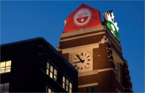
To celebrate the unveiling, red-capped “invaders” scaled Starbucks’ headquarters and stealthily replaced the famous “siren” atop the clock tower with the new Seattle’s Best Coffee logo. The intent? To put Seattle’s Best on the map as the universal symbol for great coffee.
It is an interesting stunt, I have to say. The siren superseded (albeit temporarily) by a modern looking red and white logo – never thought I’d see the day! Take a closer look at the logo.

Isn’t it just…blah? I don’t get it. I may have my complaints about Starbucks, but the logo is perfect. It is not boring. It’s a good conversation piece. It has recall. It is pretty to look at. But, this red and white thing? What are they thinking? Or maybe I don’t know anything about branding at all.
What do you have to say about the logo?
Originally posted on May 13, 2010 @ 4:24 am